How to Build a Color Palette from a Photo
Published August 18, 2026
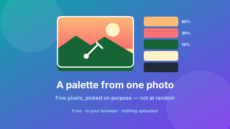
Photographs are the easiest place to find a color scheme that works, and the reason is physics rather than taste: everything in a photo was lit by the same light source, so the colors already share an undertone. That's the hard part of palette-building, solved for free.
What most people get wrong is which pixels they sample. Click five pretty spots and you'll usually end up with five versions of the same mid-tone — a palette with no contrast, which looks muddy the moment you try to use it. This guide covers the picking strategy that avoids that, plus how to balance the colors once you have them.
Sample colors from your photo
Click any pixel to get its HEX and RGB code, and collect as many as you need. Runs in your browser — free, no sign-up, nothing uploaded.
Open the Image Color Picker →Start with the right photo
Not every image makes a good source. The ones that do tend to share three traits: a clear range from light to dark, one obvious dominant color, and at least one thing that stands out against the rest. A landscape at golden hour, a market stall, a well-lit interior — these give you material to work with.
What doesn't work: photos shot in flat overcast light, where everything sits in the same narrow tonal band, and heavily filtered images, where an Instagram preset has already pushed every color toward one tint. Both produce palettes that look washed out no matter how carefully you sample.
Prefer a PNG or a large original JPG over something that's been through a chat app. Heavy compression shifts pixel values slightly, especially near edges, so a screenshot of a screenshot gives you colors that are subtly wrong.
The five points to sample
Instead of picking what catches your eye, work through this list deliberately. Open your photo in the Image Color Picker and collect one hex code for each:
- The dominant surface. Whatever occupies the most area — sky, wall, water, tabletop. This becomes your background color and sets the mood of everything else.
- A mid-tone. A secondary surface at a clearly different lightness from the first. This carries cards, panels and secondary blocks.
- The brightest accent. The one small vivid thing: a jacket, a sign, a piece of fruit. This is your button and link color, and it should feel almost too loud on its own.
- A deep shadow. The darkest area with actual color in it, not pure black. This is your text and heading color, and taking it from the photo is what stops your text looking like a generic
#333. - A near-neutral. Something close to grey or off-white — concrete, paper, cloud. Every palette needs somewhere for the eye to rest.
Notice that the list is organised by lightness, not by prettiness. That's the whole trick. Five colors spread across the tonal range will always work better together than five colors you happened to like.
Picking pixels that are actually representative
A few habits make a real difference to the codes you get:
- Stay away from edges. Boundary pixels are anti-aliased blends of two colors, so they represent neither. Click the solid middle of a surface.
- Sample the same surface two or three times and use the middle value. A wall that looks uniform can span a dozen shades across a gradient of light.
- Avoid specular highlights. The bright spot where light bounces off a shiny object is almost pure white, not the object's color.
- Beware coloured light. A white shirt in evening sun picks as warm beige. If you want the object's true color, sample the part of it that's most neutrally lit.
None of this is the picker being inaccurate — it reports exactly what the pixel contains. These habits just help you choose a pixel that means what you think it means.
Balancing the palette: 60-30-10
Having five codes isn't the same as having a design. The classic ratio, borrowed from interior design, works because it enforces a hierarchy:
- 60% — your dominant color, usually as background or large areas.
- 30% — the secondary color, for panels, sections and supporting blocks.
- 10% — the accent, reserved for buttons, links and anything you want clicked.
The accent works because it's rare. Use it on everything and it stops meaning anything — a page where every element competes for attention reads as a page with no call to action at all. If your accent feels weak, the fix is almost always to use it less, not to make it brighter.
Turning five colors into a usable set
Real interfaces need more than five values: hover states, borders, disabled text, background tints. Rather than sampling more pixels — which drifts away from the original scheme — generate the extras mathematically.
Convert your dominant color to HSL with the HEX to HSL converter, then hold the hue and saturation steady and change only the lightness. An L value around 95% gives you a background tint; 85% gives you borders; 35% gives you a hover state. Because the hue never moves, every step is unmistakably the same color. Our guide on converting HEX to HSL walks through the arithmetic, and RGB vs HEX vs HSL explains why the three notations behave differently.
Check it's readable before you commit
This is the step that separates a palette that looks nice on a swatch board from one that survives contact with real content. Colors sampled from photographs are frequently too close in lightness to use as text on each other.
The accessibility thresholds are worth memorising: body text needs a contrast ratio of at least 4.5:1 against its background, and large text (roughly 24px and up, or 19px bold) needs at least 3:1. A mid-tone teal on a mid-tone sand might be beautiful side by side and completely unreadable as text on a background.
If a pair fails, don't abandon the color — take it into HSL and push the lightness apart. Dropping the text color to 25% lightness or lifting the background to 95% usually fixes it while keeping the scheme intact.
Save your palette somewhere durable
Hex codes are easy to lose. Paste them into a note the moment you pick them, in a fixed order (dominant, secondary, accent, dark, neutral) so you can tell at a glance which is which. If you're handing them to someone else, include a one-word label for each — "background", "button", "heading" — because a bare list of six-character codes tells the recipient nothing about how you meant them to be used.
Is it private and free?
Yes. The Image Color Picker reads pixels with JavaScript entirely inside your browser, so your photo is never uploaded to a server — which matters when the source is a client's product shot or an unreleased design. It's free, with no sign-up, no watermark and no limit on how many colors you sample. Load the page once and it keeps working with your connection switched off.
FAQ
How do I make a color palette from a photo?
Open the photo in a color picker and sample five points: the largest background area, a mid-tone surface, the brightest accent, a deep shadow, and one neutral. Copy each hex code as you go. Choosing the points yourself gives a more usable palette than an automatic extractor, which tends to return five near-identical shades.
How many colors should a palette have?
Five is the practical maximum for most work — one dominant, one secondary, one accent, plus a light and a dark neutral. Beyond that, nothing reads as the main color. Plenty of good designs use only three.
Why do colors picked from a photo look muddy together?
Usually because every sample came from the same tonal range, so there's no contrast between them. Deliberately pick across the range — something very light, something mid, something very dark — and the palette gains structure immediately.
What ratio should I use for palette colors?
The 60-30-10 rule is a reliable starting point: roughly 60% of the design in your dominant color, 30% secondary, 10% accent. The accent works precisely because it's rare, so using it more heavily weakens it.
Can I check that my palette is readable?
Yes. Body text needs a contrast ratio of at least 4.5:1 against its background, and large text at least 3:1. Colors pulled from photos often fail this, especially mid-tone on mid-tone, so test every text-and-background pair before committing.
Is there a free tool to pick colors from an image?
Yes. Toolyard's Image Color Picker reads pixels inside your browser, so the photo is never uploaded to a server. No sign-up, no watermark, no limit on how many colors you sample.
Build your palette now
Drop in a photo, click the colors you want, and copy the hex codes — free, private and no account needed.
Open the Image Color Picker →