Substack Image Sizes: Logo, Header and Post Images
Published August 31, 2026
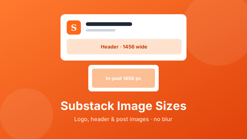
Substack keeps its design deliberately clean, which is lovely to read but frustrating when you are trying to work out what size an image should be. Unlike some platforms, Substack does not hand you a tidy chart for every slot — it quietly scales whatever you upload to fit. That is forgiving, but it also means a logo can come out fuzzy or a header can turn soft if you feed it the wrong file. This guide lays out the sizes that actually matter for a Substack publication — the logo, the cover or header, the images inside your posts, and the social preview — and is honest about where Substack's own numbers stop and sensible practice begins.
Resize for Substack without any design software
Drop an image, pick a width, download. It runs in your browser — free, private, and nothing is uploaded.
Open the Social Media Resizer →The sizes, at a glance
| Where it appears | Upload size (pixels) | Shape / notes |
|---|---|---|
| Publication logo | 256 × 256 or larger | 1:1 square, often shown round |
| Cover / header image | ~1456 wide (e.g. 1456 × 816) | Wide landscape, about 16:9 |
| Image inside a post | up to ~1456 wide | Fills the ~1150 px column; 2× for retina |
| Social / link preview | 1200 × 628 | About 1.9:1 (Open Graph) |
| Word mark (text logo, optional) | ~1344 × 256 | Long horizontal strip, ~21:4 |
A word of honesty first. Substack does publish a short help article on "optimal image dimensions," but it is sparser and vaguer than the guidance most platforms give, and it does not state a number for every slot — the exact width of the in-post content column, for instance, is not officially documented. So the figures above blend Substack's own recommendations with what its layout actually renders on screen. Treat them as reliable targets, not laws carved in stone.
The single most useful thing to understand is that Substack auto-scales everything. You are not matching a pixel-perfect grid the way you might for a print file; you are handing Substack an image that is big enough and the right shape, and letting it shrink that down to wherever the picture appears. Upload something too small and it looks soft. Upload something enormous and you gain nothing visually — you just make the page slower to load.
The publication logo: small, square, sometimes round
Your logo is the little square that sits at the top of your publication and next to your name in the Substack app and in readers' inboxes. Upload it as a square of at least 256 × 256 pixels. If you want it to stay crisp on high-resolution phone and laptop screens, 512 × 512 is a safer bet — the file is still tiny, and there is no downside.
Two things trip people up here. First, the logo is displayed small, so intricate detail and any words simply disappear. A bold single letter, monogram, or simple icon reads far better than a shrunk-down business card. Second, in several spots — comments, the app, some avatars — the square is masked into a circle. Keep your mark centered with a little breathing room around it, so nothing important gets clipped by that round crop.
Cover and header images: go wide, go high-resolution
The cover or header is the wide banner across the top of your publication and your welcome page. This is a landscape shape, so a tall portrait photo will be badly cropped — choose or build something horizontal from the start. For sharpness, upload it at least 1200 pixels wide, and ideally around 1456 (roughly 1456 × 816 gives you a clean 16:9). On a big retina monitor a header stretches nearly edge to edge, and that is exactly where an under-sized file betrays itself with soft, mushy edges.
Because Substack scales the banner to fit different screen widths, avoid pushing essential text right up against the edges. Give a headline or logo inside the image a comfortable margin so it survives when the banner is squeezed on a narrow phone. If your publication also uses a word mark — the horizontal text version of your title — that lives in a long, thin strip; roughly 1344 × 256 with a transparent background is a sensible target, though it is one of the looser, less-documented slots.
Images inside a post: match the column, then double it
This is where sharpness is won or lost. On desktop, Substack renders the reading column at roughly 1150 pixels wide. A full-width image therefore only needs to be about that wide to fill the space — but because so many readers are on high-resolution screens, the practical rule is to upload at about twice the display width. A file around 1456 pixels wide hits that comfortably and stays crisp when the browser packs extra pixels into each point.
There is one shape trap to know about: Substack limits how tall a full-width image can be relative to its width, so a very tall picture can be cropped toward a square in the reading view. If you have a long, portrait screenshot, keep the important part near the middle, or split it into pieces rather than relying on one towering image that gets trimmed.
And do not over-think smaller inline images. A photo that only ever appears at half width does not need 3000 pixels; sizing it to what it will actually display keeps your post light and quick to open, which matters most on mobile data.
The social preview image
When someone shares your post, the card that unfurls on other platforms uses a social preview (an Open Graph image). Aim for about 1200 × 628 pixels, a ratio close to 1.9:1. Substack usually pulls this from your post's cover image, so if you want a reliable, good-looking share card, make sure the cover you choose reads well at that wide, letterbox shape — a busy image with the subject near an edge can end up awkwardly cropped in the preview.
How to resize an image for Substack, step by step
The Toolyard Social Media Resizer runs entirely in your browser — nothing is uploaded, and there is no account to make. It has a Substack group of presets — logo 512×512, header or cover 1456×816, social preview 1200×628 and word mark 1344×256 — and a Custom size option for anything else:
- Open the Social Media Resizer and drag your image in, or click to browse. JPG, PNG and WebP are all accepted, and you can drop several at once.
- Under Target size, open the Substack group and pick the header or cover (1456 × 816), logo (512 × 512), social preview (1200 × 628) or word mark (1344 × 256). For an in-post image, choose Custom size and set the width to about 1456 px.
- Choose a Fit mode. Cover fills the frame and trims the overflow — right for photos. Contain shrinks the whole image to fit and pads the gap with a background colour you pick — right for a logo or a screenshot where cropping would ruin it.
- Pick the Format: JPG for photographs, PNG for logos, screenshots and anything with text or a transparent background.
- Click Download (or Download all for a batch), then upload the result into Substack's editor or settings.
Because Substack auto-scales, you do not need to obsess over hitting a size to the pixel — getting the width into the right ballpark and the shape correct is what keeps the final result sharp.
Choose the crop yourself
For a wide header, pick the exact strip of the photo you want to keep before you resize it — free, in your browser.
Open the Image Cropper →Why bigger is not always better
It is tempting to upload the largest file you have "just in case," but that backfires on Substack. Since the platform scales images down anyway, a 6000-pixel photo displays no better than a 1456-pixel one — it simply weighs more, and a heavy post is slow to open, especially for email readers on a phone.
Pick the format by content, not habit. Photographs belong in JPG, which gives a far smaller file for the same apparent quality. Logos, charts, code snippets, screenshots and anything with crisp text or transparency belong in PNG, because JPG compression smears fuzzy halos around sharp edges and thin letters. And resize down, never up: shrinking a big photo to 1456 wide keeps almost all its detail, while enlarging a small image to fill a header can only invent pixels, and it always looks soft.
Is it private and free?
Yes on both counts. The Toolyard resizer and cropper are completely free — no sign-up, no watermark, no limit on how many images you process. They are also 100% private: the work runs as JavaScript on your own machine, so your files are never uploaded to any server. That is genuinely handy when the image is an unpublished cover, a draft graphic, or a client's logo. Once the page has loaded, it even keeps working offline.
One tool, every platform
Substack, Instagram, YouTube, X, Facebook, LinkedIn and Pinterest sizes in one place. Free and private, in your browser.
Open the Social Media Resizer →FAQ
What size should a Substack header or cover image be?
Use a wide landscape image and upload it large: around 1456 pixels wide (roughly 1456 × 816) stays crisp on high-resolution screens, and anything below about 1200 wide starts to look soft. Substack scales the file to fit, so aim for the right shape and plenty of pixels rather than one exact size.
What size should the Substack logo be?
Upload a square of at least 256 × 256 pixels, and 512 × 512 or larger for retina sharpness. Substack shows the logo small and, in several places, as a circle, so center your mark, keep it simple, and avoid fine detail or text near the edges.
What size should images inside a Substack post be?
Substack displays the post column at roughly 1150 pixels wide on desktop. Uploading images about 1456 pixels wide — twice the display width — keeps them sharp on high-resolution screens. Very tall images can be cropped toward a square, so keep key detail away from the extreme top and bottom.
What size is the Substack social / link preview image?
Use about 1200 × 628 pixels, a ratio near 1.9:1. It is the same shape most platforms expect for an Open Graph image, and Substack usually generates it from your post's cover, so pick a cover that reads well when cropped wide.
Does Substack compress or resize my images?
Yes. Substack automatically scales images to fit wherever they appear, so the goal is big enough and the right shape, not an exact pixel grid. Uploading something far larger than needed only slows the page without looking better, so resize before you upload.