QR Code Size for Printing
Published September 14, 2026
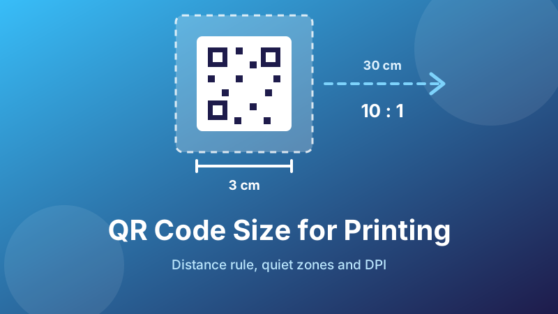
A QR code that works perfectly on your screen can be useless on paper. The pattern is identical; what changed is that the camera is now further away, the light is worse, the ink has spread slightly, and the designer shrank the code to fit the layout. Almost every “the code doesn't work” complaint traces back to one of those four things, and all four are decided before you press print.
Here are the actual numbers — minimum sizes, the distance rule, quiet zones and resolution — so your code scans first time, from the distance people will really stand at.
Need the code itself?
Generate a clean, high-resolution PNG in your browser — no sign-up, no watermark, nothing uploaded. Choose Large for anything going to print.
Open the free QR Code Generator →The 10:1 rule
One rule covers most decisions: the printed code should be at least one tenth as wide as the distance it will be scanned from.
Scanning distance divided by ten equals minimum code width. A code read from 30 cm in someone's hand needs to be 3 cm across. A poster people stand two metres from needs 20 cm. A code on a wall three metres up needs 30 cm — which is usually the moment a client discovers their code needs to be bigger than their logo.
The rule is deliberately conservative, and that is the point. It assumes an average phone rather than the newest one, indoor lighting rather than daylight, and someone who does not stop to line up a perfect shot. Codes designed at exactly the theoretical minimum scan for the designer testing them on a new phone at their desk, and fail for the customer.
Minimum sizes by medium
| Where | Scanned from | Minimum code size |
|---|---|---|
| Business card | ~20 cm | 2 cm (0.8 in) |
| Product label / packaging | ~25 cm | 2–2.5 cm (1 in) |
| Flyer, menu, leaflet | ~30 cm | 3 cm (1.2 in) |
| Table tent / counter sign | ~50 cm | 5 cm (2 in) |
| A4 / A3 poster | 1–2 m | 10–20 cm (4–8 in) |
| Shop window | 2–3 m | 20–30 cm (8–12 in) |
| Exhibition stand banner | 3–5 m | 30–50 cm |
| Billboard | 20 m+ | 2 m+ — usually not worth it |
2 cm is the absolute floor for anything held in the hand. Below that, module edges start disappearing into ink spread on ordinary paper and scans become a coin toss. If a designer proposes a 1.5 cm code, the honest answer is that it will work on their phone and fail on a third of your customers'.
And the billboard row is not a joke — drivers cannot scan, and the pedestrians who could are usually too far away. A memorable short web address beats a QR code at that scale.
Data length changes everything
Two codes at the same printed size can behave completely differently, because a QR code grows in versions. Each step up adds four rows and four columns to the grid, and at a fixed physical size that means each individual square — a module — gets smaller.
https://toolyard.com— about 20 characters. A coarse grid with large modules that scans easily from a distance.- A full contact card with address and job title — 300 characters. At the same 3 cm it is a fine mesh, and a camera needs to be close, steady and well lit to resolve it.
The practical consequence: shortening your content is usually cheaper than enlarging the code. Point at yoursite.com/menu instead of a 90-character link with tracking parameters, and trim contact cards to the essentials. A shorter string buys you scanning distance for free.
Error correction cuts the same way. Level H adds roughly 30% damage tolerance but also a good deal of density. For print, M is the right default; move up to Q or H only when the code will be scuffed, folded or partly covered by a centre logo — and then print it bigger to compensate.
The quiet zone — the most common mistake
A scanner finds a QR code by locating its three corner squares against empty surroundings. Take that emptiness away and it may never realise there is a code there at all.
The quiet zone is a blank margin of at least four modules on all four sides — roughly a tenth of the code's width. On a 3 cm code that is about 3 mm of nothing.
What eats into it, constantly:
- A caption such as “Scan me!” tucked right under the pattern
- A decorative box or frame drawn around the code
- The edge of the page, a fold line, or the trim of a label
- A background photograph or coloured panel running up to the code
- Another element in a tight grid layout
Keep the margin white and empty, and keep the code clear of any fold or die-cut — a crease through the pattern breaks it, and a crease through the quiet zone can too.
Generate a print-ready code
Pick Large for a high-resolution PNG you can scale down to any print size without losing edge sharpness.
Make my QR code →Resolution: get the DPI right
Print work wants 300 DPI at the final size. In pixels, that is the printed width in inches multiplied by 300:
- 2 cm (0.8 in) card code → about 240 px minimum, 500 px comfortable
- 3 cm (1.2 in) flyer code → about 350 px minimum
- 20 cm (8 in) poster code → about 2400 px
Two rules that matter more than the exact number:
- Always scale down, never up. Enlarging a small PNG softens the boundary between black and white squares, and that boundary is precisely what the scanner measures. Generate large, place small.
- Do not let the image be re-compressed into mush. Exporting the layout as a low-quality JPEG can put grey fuzz around every module. Keep the code as PNG in the artwork, and export the final file at high quality.
If your layout tool offers it, snap the code to whole pixels rather than letting it land on a half-pixel — a code placed at a fractional position gets anti-aliased, which is soft edges by another name.
Contrast, colour and finish
- Dark on light. Black on white is the reliable choice. If you must brand it, a dark navy or deep brand colour on white is usually fine — test it.
- Do not invert. A white code on a black background fails on a significant share of scanners, which expect dark modules on a light field. Some phones cope; enough do not.
- No gradients or photos behind the code. A code sitting on an image loses the consistent contrast the scanner is measuring against.
- Avoid red. Red modules read as low contrast to many camera sensors. Red is the most common branding choice and the most common failure.
- Matte beats gloss. Glossy stock, laminate and spot-UV throw reflections that wipe out part of the pattern under a ceiling light. If the finish must be gloss, print the code larger to give the camera more to work with.
- Mind the substrate. Uncoated and recycled stock absorb ink and thicken the modules slightly; curved surfaces like bottles and cups distort the pattern. Both cases want a size bump and a real-world test.
Test before the print run
Five minutes here saves a reprint:
- Print one proof on the actual stock, at the actual size, from the actual printer.
- Scan it with an old phone, not your newest one. If a four-year-old handset manages it, everyone will.
- Scan from the real distance — stand where a customer would stand, not lean over the desk.
- Test in the real light: the restaurant's evening lighting, the shop window at midday with sun on the glass.
- Try it at a slight angle and with a slightly unsteady hand. That is how people actually scan.
- Confirm the destination opens correctly on mobile — a code that scans to a broken page is still a failure.
Finally, tell people what they get. A bare square gets ignored; “Scan for the menu” or “Scan to join our Wi-Fi” gets scanned. Put that label outside the quiet zone.
Is it private and free?
Toolyard's QR Code Generator creates the code inside your browser — your link or text is never uploaded — and gives you a clean PNG with no watermark, no sign-up and no expiry. Select Large for print work so you have pixels to spare, and keep the code static so nothing you print can be switched off by a third party later.
FAQ
How big should a printed QR code be?
At least a tenth of the scanning distance: 3 cm for something read at 30 cm, 20 cm for a poster seen from two metres. The practical floor for anything hand-held is 2 cm square, and 2.5–3 cm is safer in poor light.
What is a quiet zone?
The empty margin that lets a scanner find the code's edges — at least four modules on all four sides, roughly a tenth of the code's width. Captions, frames and page edges pressed against the code are a leading cause of failed scans.
What resolution do I need?
300 DPI at final size — about 350 px for a 3 cm code. Generate large and scale down; enlarging a small image blurs the module edges that scanners depend on.
Why won't my printed code scan?
Usually too small for the amount of data, no quiet zone, low contrast or an inverted design, glare from a gloss finish, or an upscaled blurry image. Shortening the link often fixes it without changing the size.
Does more data mean a bigger code?
Yes — more characters means more rows and columns, so each square shrinks at the same printed size. A short link scans from across a room; a long contact card at the same size needs a close, steady camera.