Apple Touch Icon Size (and Android PWA Icons)
Published September 17, 2026
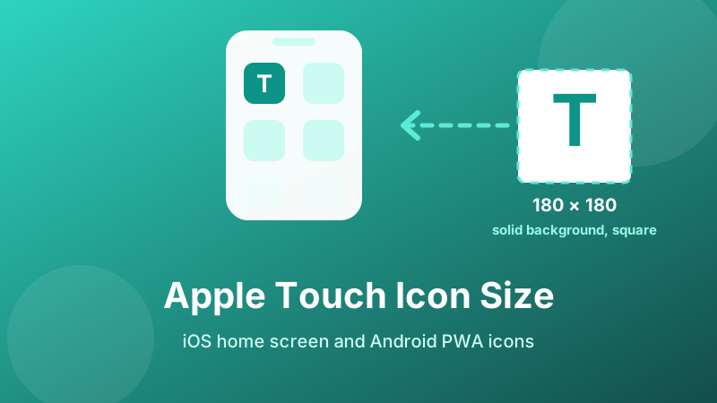
The short answer is 180×180 pixels. But the size is the easy part — most broken home screen icons are the right size and still look wrong, because iOS applies two rules that no other platform does. Here is the size, the two rules, the Android equivalent, and the HTML to paste.
Need the 180×180 file?
Drop in one square image and get the Apple icon, the Android manifest icons and every tab favicon size at once — free, processed entirely in your browser.
Open the free Favicon Generator →What the apple-touch-icon is for
When someone opens your site in Safari on an iPhone or iPad and taps Share → Add to Home Screen, iOS needs an app-style tile. It does not use your tab favicon for this — a 32 px image stretched across a home screen tile would look terrible. Instead it looks for this tag:
<link rel="apple-touch-icon" sizes="180x180" href="/favicon-180.png">
If the tag is missing, iOS falls back to a shrunken screenshot of the page or a blank tile with the first letter of the title. Both look like a bug to whoever bookmarked you.
Why 180, and only 180
180×180 is the size the largest iPhone screens request. iOS scales it down for smaller devices and iPads, and it does that scaling well, so a single file covers the whole range.
You will find older tutorials listing six or seven Apple icon sizes — 57, 72, 76, 114, 120, 144, 152. Those targeted iPhone and iPad generations that have long since stopped receiving updates. Shipping them in 2026 adds files to maintain and markup to your <head> for no visible benefit. One 180×180 is the current answer.
Do use a source image at least 512 px before you resize, though. Scaling down from something large keeps the edges crisp; scaling up from a 64 px logo produces a soft, slightly muddy tile.
Rule 1: no transparency
This is the single most common iOS icon failure. iOS does not support transparency in home screen icons. It composites whatever you give it onto black.
So the transparent-background PNG that looks perfect everywhere else becomes a black tile. If your logo is dark navy or charcoal, it effectively vanishes. People see a black square, assume the file is broken or missing, and start re-uploading it.
The fix is simply to flatten the icon onto a solid background — white, or your brand colour — before exporting the 180 px file. Note this applies only to the Apple icon; your 16 and 32 px tab favicons can keep their transparency, and should, because they sit on the browser’s own light or dark chrome.
Rule 2: do not round the corners yourself
iOS applies its own rounded mask to every home screen icon, matching the system corner radius of the moment. If you pre-round your artwork, that mask cuts an already rounded shape and you get four pale notches where the two curves disagree.
Supply a full square with artwork running to the edges and let iOS do the rounding. As a practical layout rule, keep your logo inside roughly the central 80% of the square, so nothing important sits where the corner mask bites.
Android: the manifest, not link tags
Android and Chrome ignore apple-touch-icon and read icons from the web app manifest instead — a small JSON file linked from your <head>:
<link rel="manifest" href="/site.webmanifest">
Inside it, the standard pair is 192 and 512 pixels:
| Size | Used for |
|---|---|
| 192×192 | Home screen shortcut on Android |
| 512×512 | Splash screen and install prompt |
Chrome needs at least one icon of 192 px or larger before it will offer to install a site as an app. Android also uses adaptive icons, cropping your square to a circle, squircle or rounded square depending on the phone. An icon marked "purpose": "maskable" tells Android it may crop safely — so keep the important part of the artwork within the central 80%, the same discipline the Apple corner mask demands.
Unlike iOS, Android does honour transparency, which is why a single flattened file for both platforms is the simplest path if you do not want two variants.
The HTML to paste
A complete, current set looks like this in your <head>:
<link rel="icon" type="image/png" sizes="32x32" href="/favicon-32.png"><link rel="icon" type="image/png" sizes="16x16" href="/favicon-16.png"><link rel="apple-touch-icon" sizes="180x180" href="/favicon-180.png"><link rel="icon" type="image/png" sizes="192x192" href="/favicon-192.png"><link rel="icon" type="image/png" sizes="512x512" href="/favicon-512.png">
Two details worth checking. Use root-relative paths starting with a slash, or the icon will break on every page except the home page. And upload the files to your site root, not into a subfolder, unless you update the paths to match.
How to generate them
- Start from a square image of 512 px or larger. Non-square input gets centre-cropped, so anything near the edges is lost.
- If the logo is dark, flatten it onto a solid background before you start — that is the file iOS needs.
- Open the Favicon Generator and drop it in. You get 16, 32, 48, 64, 180, 192 and 512 px PNGs immediately.
- Download them, upload to your site root, and paste the generated link tags.
- Test on a real phone: add the site to your home screen and look at the tile. That is the only check that catches the black-background problem.
If the old icon persists after you deploy, that is the favicon cache rather than a bad file — see favicon not showing for the fix.
Is it private and free?
Yes. The Toolyard Favicon Generator does the resizing with the browser’s own canvas, so your logo is never uploaded to a server. No sign-up, no watermark, no limit — and once the page has loaded it works offline.
Generate your home screen icon
One square image in, the 180 px Apple icon, the Android manifest sizes and every tab favicon out.
Open the Favicon Generator →FAQ
What size should an apple-touch-icon be?
180×180 pixels. iOS scales that down cleanly for smaller iPhones and iPads, so one file covers every device. The long lists of 57 to 152 px icons in older guides target iOS versions no longer in use.
Why is my iOS icon a black square?
The PNG has a transparent background, and iOS composites transparency onto black. Flatten the 180 px icon onto a solid background — white or your brand colour — before exporting.
Should I round the corners myself?
No. iOS applies its own mask, so pre-rounded artwork gets cut twice and shows pale notches in the corners. Supply a full square and keep the logo inside the central 80%.
What does Android need?
192×192 and 512×512 icons declared in the web app manifest. Chrome wants at least 192 px before offering installation, and a maskable 512 keeps adaptive icon shapes from cropping your logo.
Do I still need a normal favicon too?
Yes — the 16 and 32 px tab icons are a separate job. Without an apple-touch-icon, iOS falls back to a page screenshot or a blank tile.